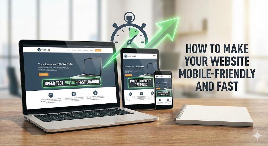
Picture the scene: a potential client is commuting on the Central Line or waiting for a bus in Clapham. They have a few minutes to spare, so they search for your services on their smartphone. They click your link.
One second passes. Two seconds. Three seconds. The screen is still white, or elements are jumping around as they load. What happens next? They hit the "Back" button and go to your competitor. In 2025, mobile performance is not just a technical requirement; it is the primary driver of user retention. If your site isn't fast and thumb-friendly, you are invisible.
At Custom Coded Websites, we engineer platforms that fly on mobile networks. Here is our guide to making your website mobile-friendly and lightning-fast.
1. True Responsiveness (Not Just "Shrinking")
Many template builders claim to be "mobile responsive," but often they just squash the desktop version until it fits a phone screen. This leads to tiny text, unclickable buttons, and a poor user experience.
The Solution: You need a "Mobile-First" design philosophy. This means:
- Touch Targets: Buttons must be at least 44x44 pixels so a thumb can easily tap them without hitting the wrong link.
- Readable Text: Font sizes should scale appropriate so users don't have to pinch-and-zoom to read your content.
- Stacking Order: Content should re-arrange logically. A three-column layout on a desktop should become a single, scrollable column on mobile.
2. Eliminate "Code Bloat"
The number one reason for slow mobile websites is unnecessary code. When you use a generic WordPress theme or a drag-and-drop builder, the browser has to download huge JavaScript libraries and CSS files, even if you aren't using the features they power.
The Custom Difference: Mobile processors are weaker than desktop computers, and mobile data (4G/5G) can be inconsistent. By using custom Python/Django development, we send only the exact code required to render the page. There is no "fat." This results in near-instant load times, even on a patchy signal.
3. Optimise Your Images
High-resolution photography looks great on a 27-inch monitor, but downloading a 5MB image file on a phone is a disaster for speed.
The Technical Fix:
- Next-Gen Formats: Convert all images to WebP or AVIF formats. These provide the same quality as JPEG but at a fraction of the file size.
- Responsive Images: Use code that serves different image sizes based on the device. A phone should never download a desktop-sized background image.
- Lazy Loading: Ensure images further down the page only load when the user scrolls near them. This prioritises the initial screen (the "above the fold" content).
4. Minimise Server Response Time (TTFB)
Before your phone can display anything, it has to wait for your server to reply. If you are on cheap shared hosting or using a resource-heavy CMS, this "Time to First Byte" (TTFB) can be sluggish.
The Solution: We use high-performance cloud hosting and the Django framework, which is highly efficient at processing database queries. We also implement server-side caching, meaning the server remembers the page and can hand it to the user instantly without having to rebuild it every time.
5. Avoid Pop-Ups (Interstitials)
Google penalises sites that show "intrusive interstitials"—those annoying pop-ups that cover the whole screen asking you to sign up for a newsletter before you have read a single word.
The UX Fix: On mobile, screen real estate is precious. Avoid covering the content. If you need to capture leads, use a subtle banner at the bottom of the screen or an inline form. Respect the user's intent to read your content first.
6. Use a Content Delivery Network (CDN)
A CDN stores copies of your website on servers all around the world. If a user visits your site from New York, they download it from a US server. If they visit from London, they get it from a London server.
Why it matters: This reduces latency (the physical travel time of data). For a mobile user, this can shave vital milliseconds off the load time, making the site feel snappy and responsive.
Conclusion
Making a website mobile-friendly isn't just about passing Google's test; it's about respecting your customer's time. In a city as fast-paced as London, a fast mobile site is a competitive advantage that directly impacts your bottom line.
Is your mobile site driving customers away? Let's fix it.
Contact Custom Coded Websites for a mobile performance audit today.
