For decades, web design followed a predictable pattern: build a stunning, expansive website for the desktop monitor, and then squeeze a simplified version onto the phone screen.
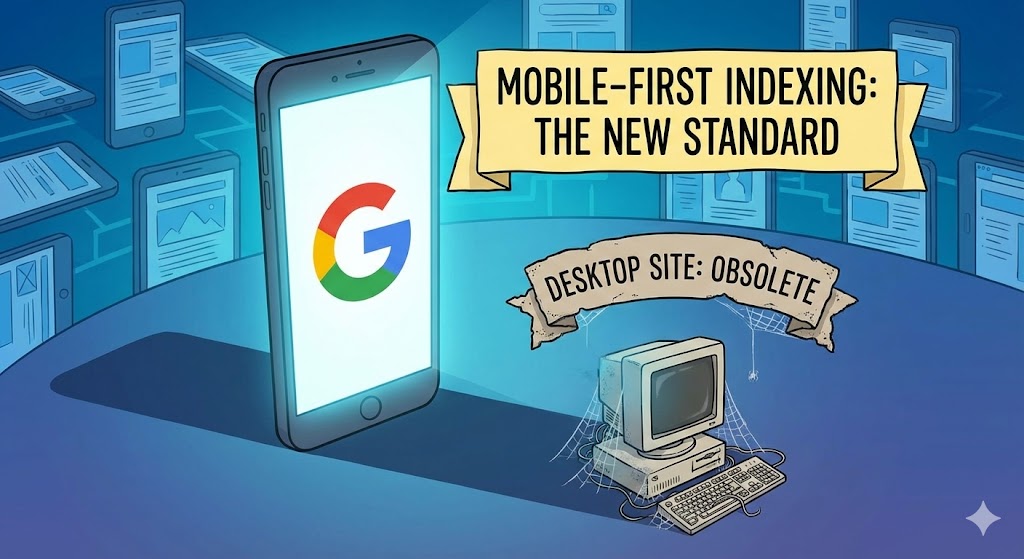
If you are still following this workflow in 2025, your SEO strategy is built on a lie. Google has fully transitioned to Mobile-First Indexing. This means that Googlebot—the crawler that ranks your website—has stopped looking at your desktop site almost entirely. It now browses the internet exclusively disguised as a smartphone.
What Is Mobile-First Indexing?
Simply put, Google uses the mobile version of your content for indexing and ranking.
In the past, if your desktop site had 1,000 words of rich content but your mobile site only had 200 words (for the sake of "clean design"), Google would rank you based on the 1,000 words. Today, Google ranks you based on the 200 words. If it isn't on mobile, as far as Google is concerned, it doesn't exist.
The "Content Parity" Trap
The biggest mistake we see business owners make is creating a "Lite" version of their site for mobile users. They hide complex tables, shorten product descriptions, or remove sidebar links to make the mobile UI look cleaner.
Under Mobile-First Indexing, this is disastrous. You must achieve Content Parity. The primary content, metadata, and structured data on your mobile site must be identical to your desktop site.
3 Signs Your Mobile Site is Hurting Your Rank
1. The "Read More" Button
While Google has stated that content hidden behind tabs (accordions) on mobile is treated normally, content that is physically missing from the HTML until a user clicks a button can sometimes be ignored by the crawler. Ensure your key keywords are visible by default.
2. Slow Mobile Load Times
Your desktop site might load in 1 second on a fiber connection, but how does it handle a 4G connection? Google measures your speed based on real-world mobile data. If your high-res images aren't optimized for mobile data networks, your ranking drops.
3. Unplayable Content
If you have video formats or license agreements that only work on desktop, Google considers this a "soft 404" error. If the mobile user can't see it, the page is broken.
The Django Solution: Responsive by Default
At our agency, we don't build "mobile sites." We build Responsive Applications. Using frameworks like Bootstrap or Tailwind CSS within Django, we ensure that the HTML served to a phone is the exact same HTML served to a desktop.
The layout changes, but the data does not. This guarantees that no matter how Google chooses to crawl your site, they see the full value of your content.
Summary
Stop looking at your website on your laptop. Open your phone. That is the only version of your website that Google cares about. If the experience there is second-rate, your business is second-rate in the eyes of the search algorithm.